
AlienVault: ready for launch
Role: UX Director
Participants: Product, Engineering, UX Designers, Visual Designers, SMEs
Timeline: 1 year
Results: Acquired by AT&T
AlienVault’s Unified Security Manager was ready to release to the public in January - a very exciting start to the year!
But we had a lot to learn about how potential customers would react. We knew there were feature gaps, so we used every new feature that we delivered as an opportunity to incrementally refine the UI in collaboration with our front-end team in Spain.
We also gathered feedback from potential customers and leveraged our internal resources who were on the front-lines during sales conversations to understand how users were digesting this new product.

The engineering team gave us a headstart
We used their work to start iterating on visual design and hierarchy.
Initially, we prioritized a couple of key areas:
Reduced the size of the navigation to move the primary content up on the page
Removed background pattern and toned down grays to appear less "stripe-y"
Increased size and contrast for text to appear more legible
Used font weight, size and color to prioritize information
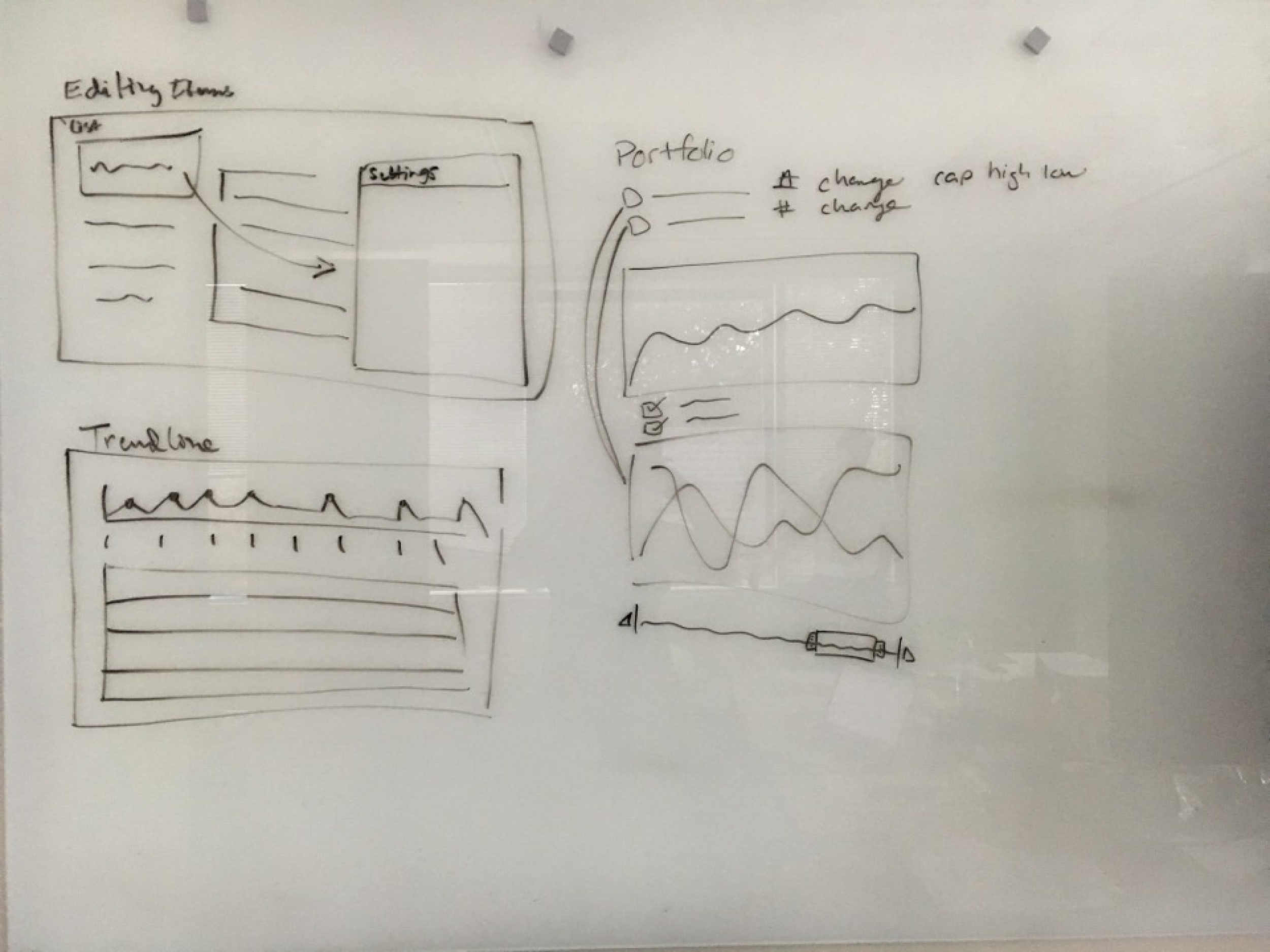
From there, we got into the details:
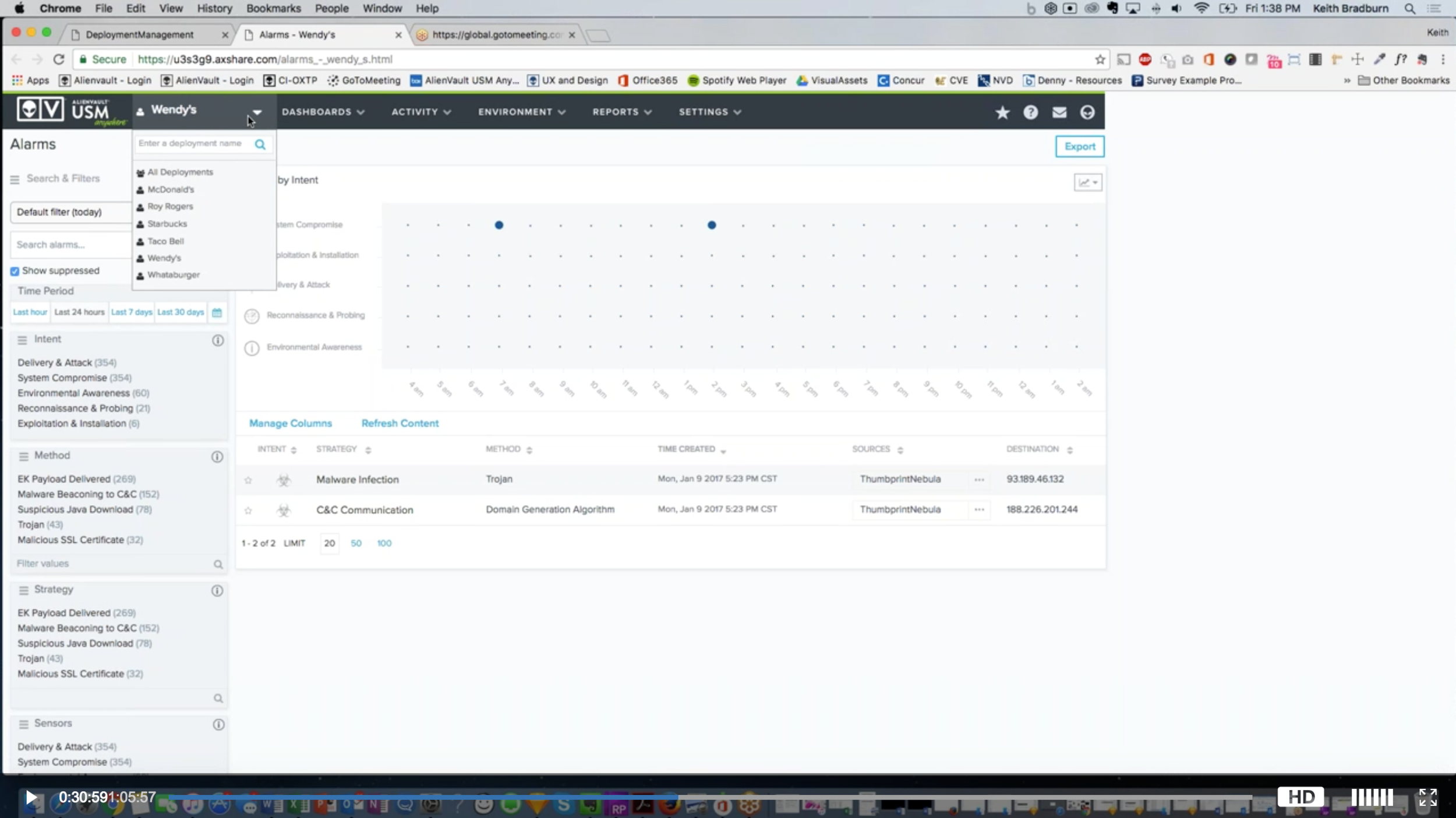
We summarized chunks of related details within a single column.
Reduced horizontal scrolling to see all the relevant information.
Provided more context to interpret discreet data and tell a better story.
Reduced visual weight of priority indicators, while still drawing users' attention to the red (bad) areas
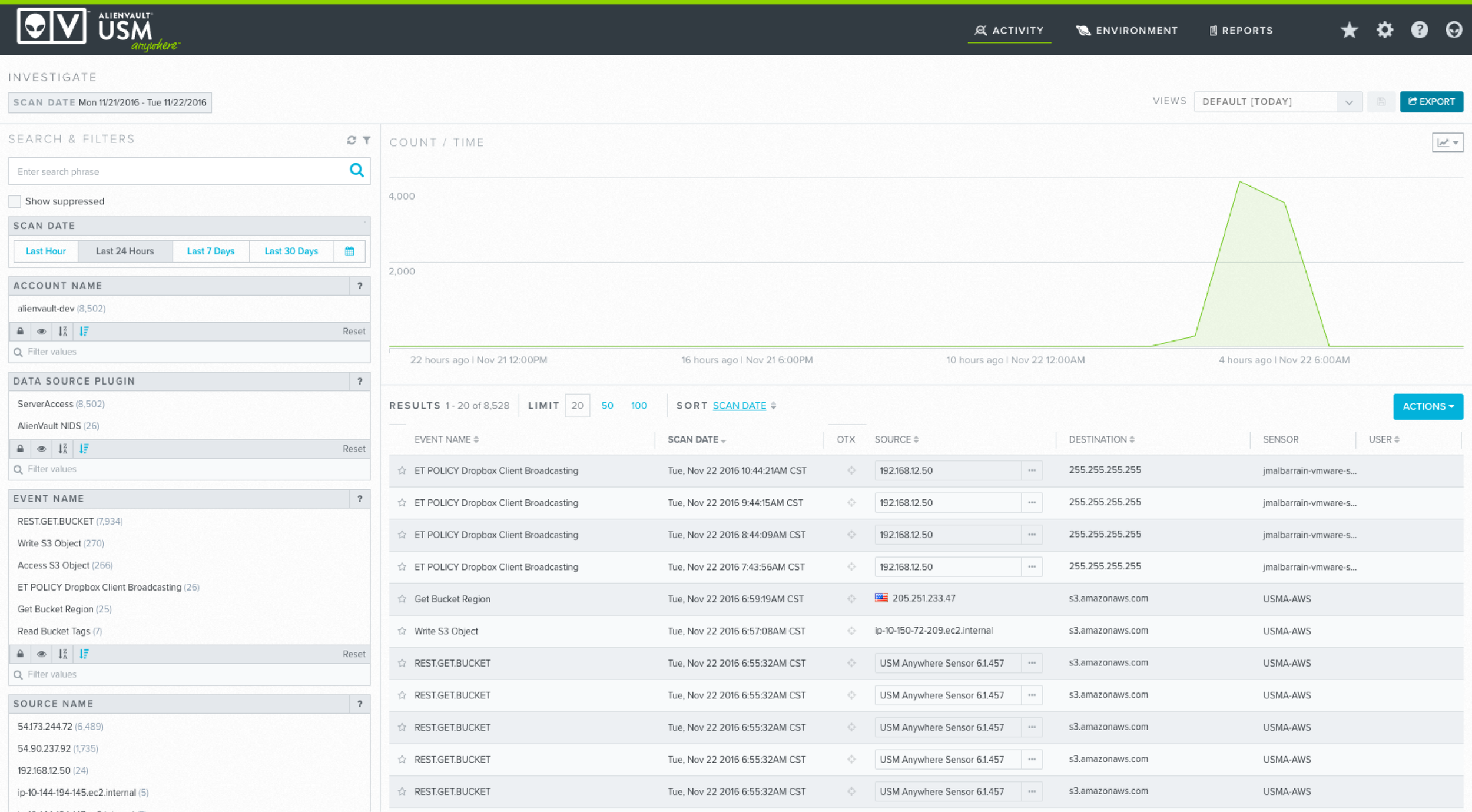
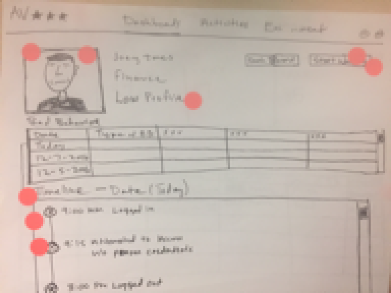
Engineering gave us a starting point. We had the basic layout, content and data to play with. But there is a lot of information to take in, and visual noise was getting in the way.
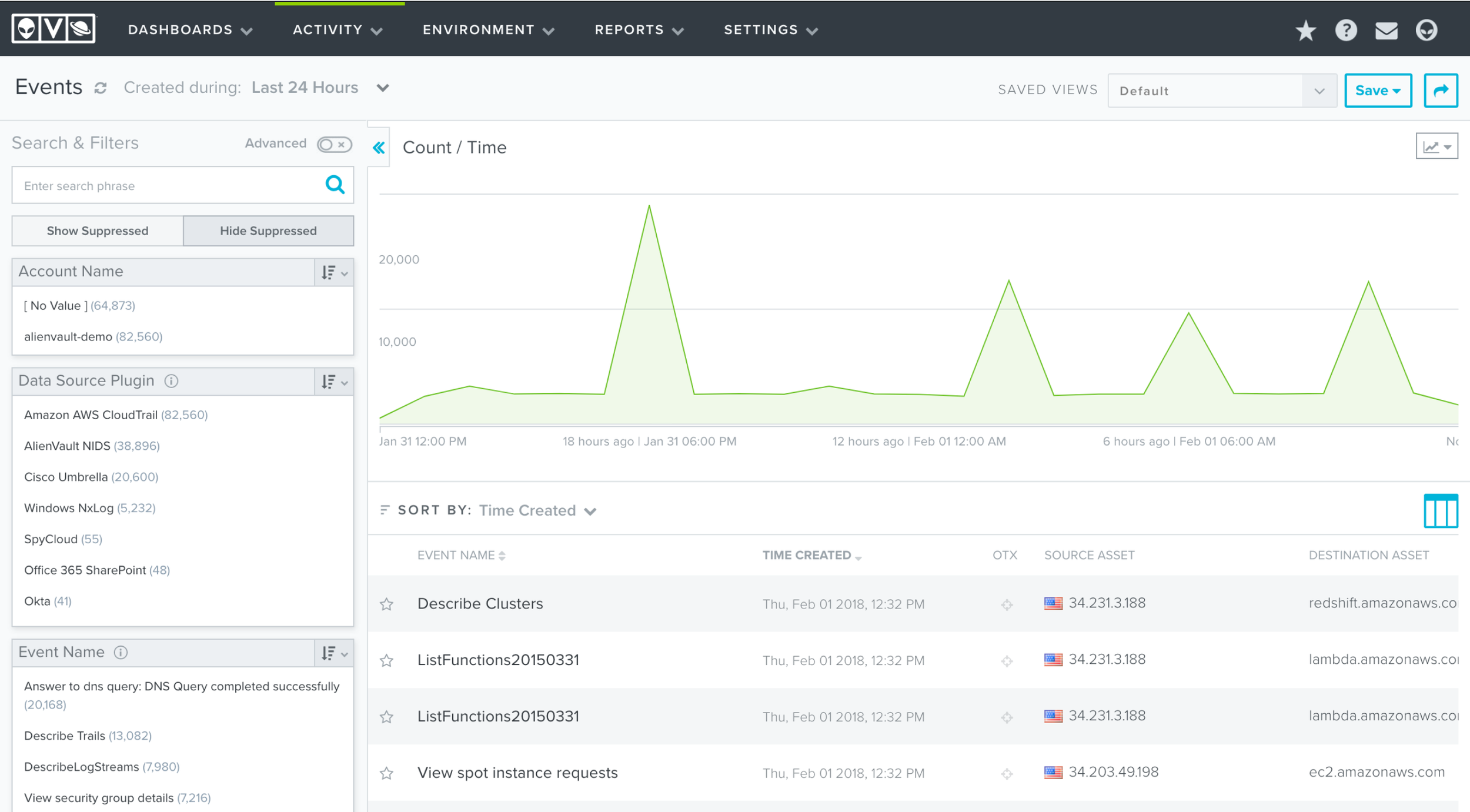
The dashboard evolved to streamline the UI elements so the information becomes the main attraction. Reduced navigation, simplified background colors, larger fonts and more clear hierarchy
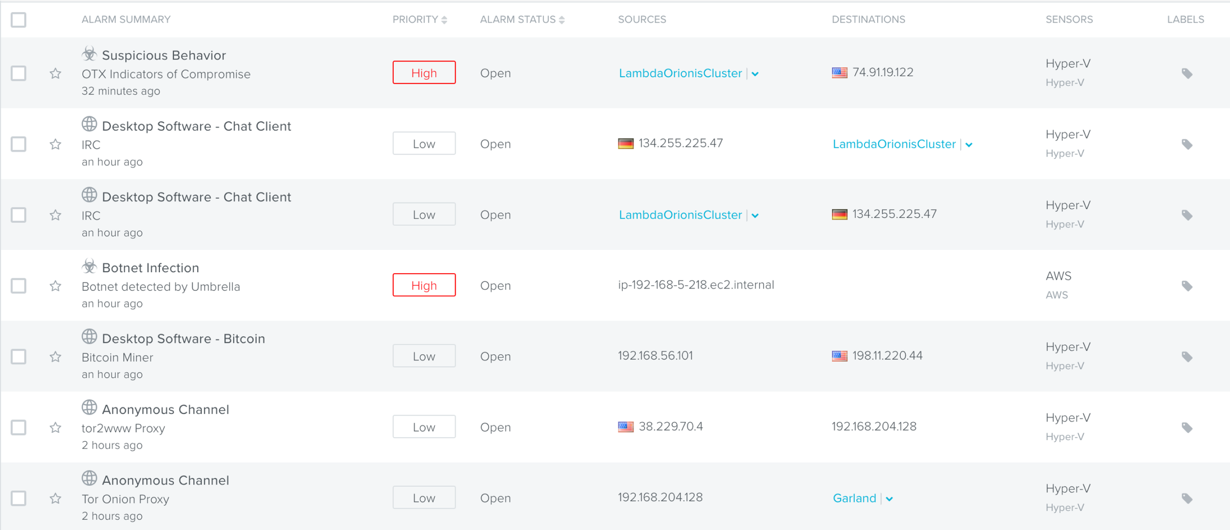
The list view was an important part of the experience - this is where users decide to take action. We updated the design to help users focus on the elements that need their attention and reduced distractions.
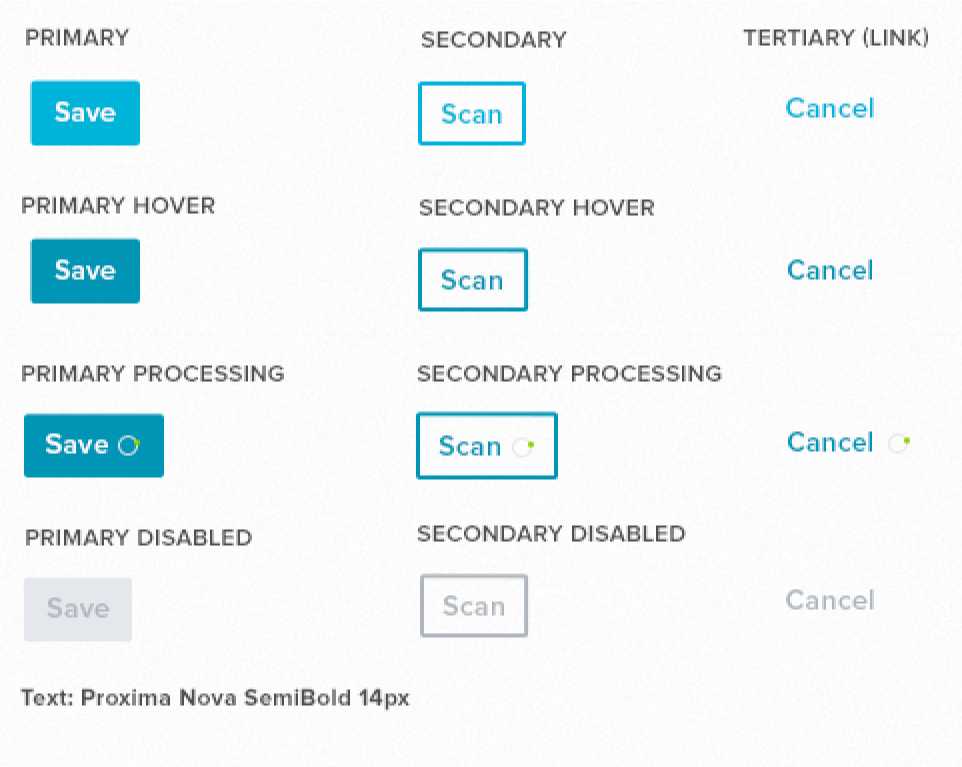
Consistent button patterns helped to minimize noise. We wanted to make sure that primary actions stood out so users know what to do next. Secondary or tertiary buttons are visible and accessible but they don't distract.
Simultaneously, we were exploring how to better enable sales and increase the total addressable market.
At a certain size, most businesses require a standard set of controls to manage large amounts of data and users. After the initial release of our SaaS product, we needed to reduce sales friction for those larger deals by supporting their needs.
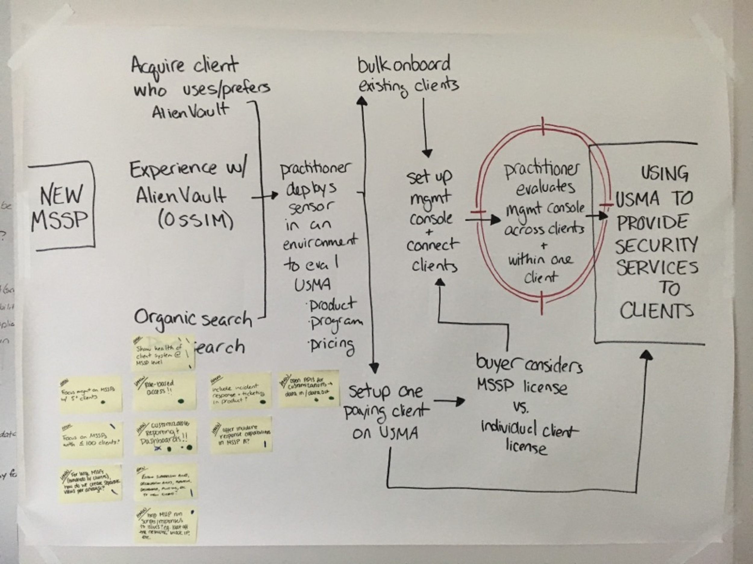
But how do you support those higher-level use cases without adding complexity to the standard product? Unified Security Manager Central: a federated console that pulls together information from distributed environments into a single place.
Desired user testing outcome:
New customers who provide services to multiple clients will adopt our Saas product if we:
Summarize alarms, events, assets, etc. across clients (including Appliance)
Centralize management and orchestration of Anywhere clients
Rest API
Single sign on from MSSP Anywhere → client
Create simple USM Anywhere client on-boarding
… without requesting X, Y, Z in addition.
Desired business outcome:
>1/3 of our USM Anywhere business ($) should come from MS(S)P clients
Mapped the full experience
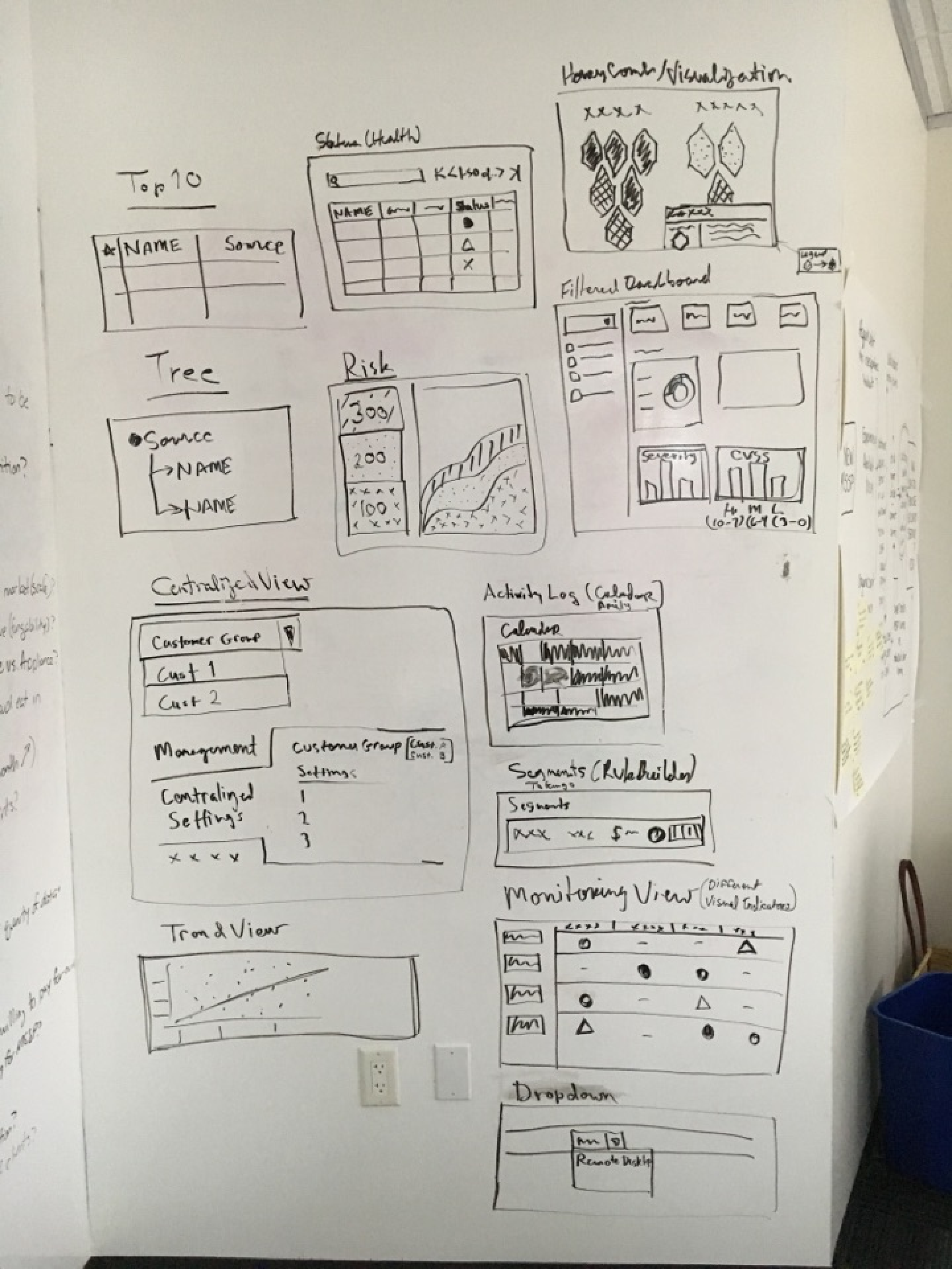
Sketches from SMEs
Developers offering solutions
Voting
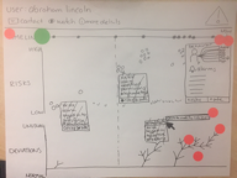
Discussing
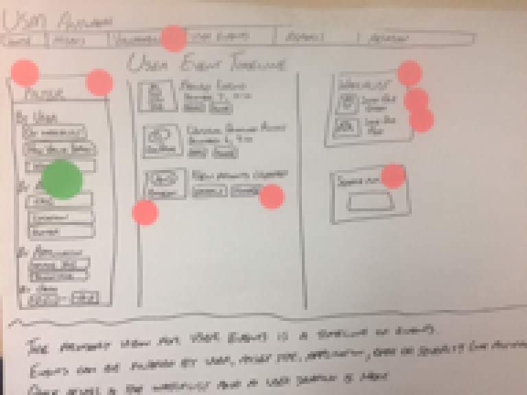
Taking the best ideas to prototype
Testing with users
As a result of testing these ideas with customers, we were able to isolate the most valuable ideas and build those into the product:
Build a federated console with a rest API
Summarize alarms, events, assets, etc. across clients (including Appliances)
Provide documentation for service providers to deploy agents and onboard new clients
We didn’t solve every problem that we identified in the workshop, but we did enable sales to close bigger deals by the biggest issues unique to those users.