
SolarWinds: an evolution
Role: UX designer, manager and director
Timeline: 7 years
Results: Growing customer fanbase
SolarWind’s flagship product, Orion was selling really well! Easy to find, easy to evaluate, easy to buy. But the business wanted to grow. Fast. Additional features, new products, acquisitions, and move desktop apps to the web. Can we do it all and do it well? No, we had to make choices.
Orion’s design evolution occurred over many years and included milestones like replacing button images with HTML/CSS, adding modern charting packages, and continuously improving navigation to accommodate the growing product suite.
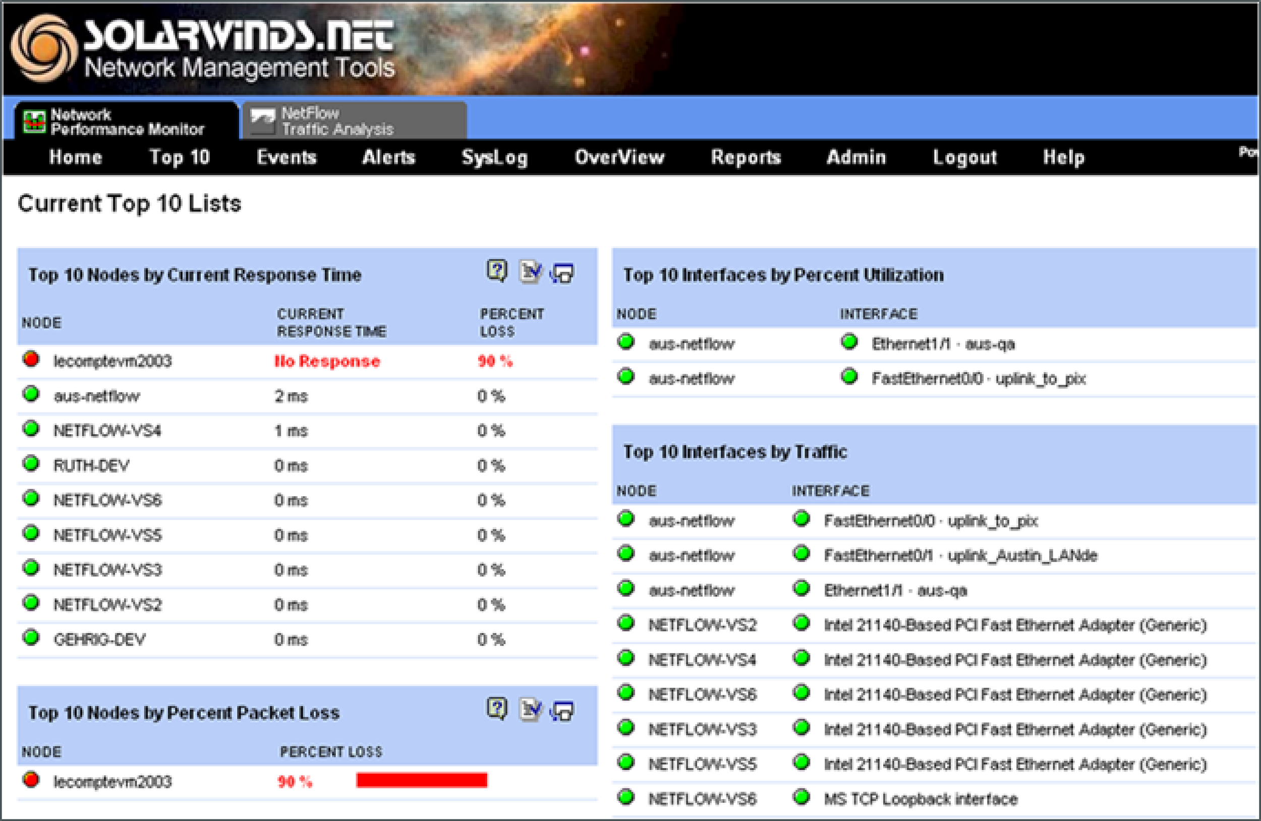
The origin story: before my time
Where I started: improved icons, new color palette, added visual hierarchy using font weight and size
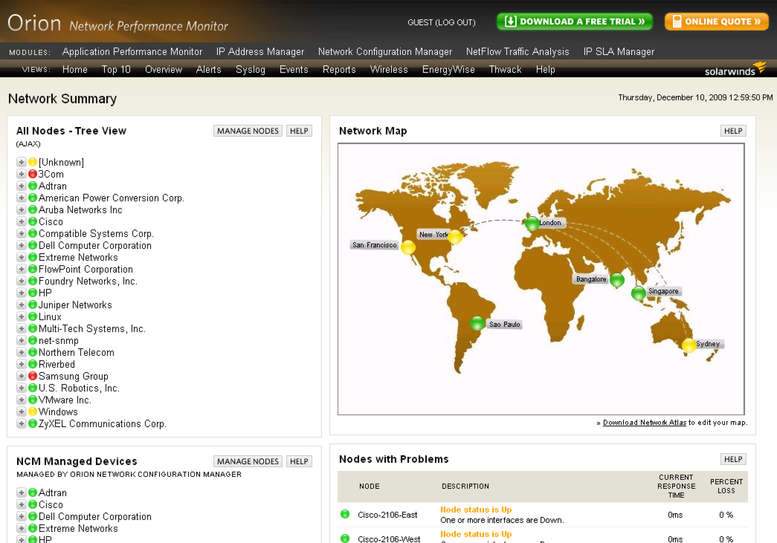
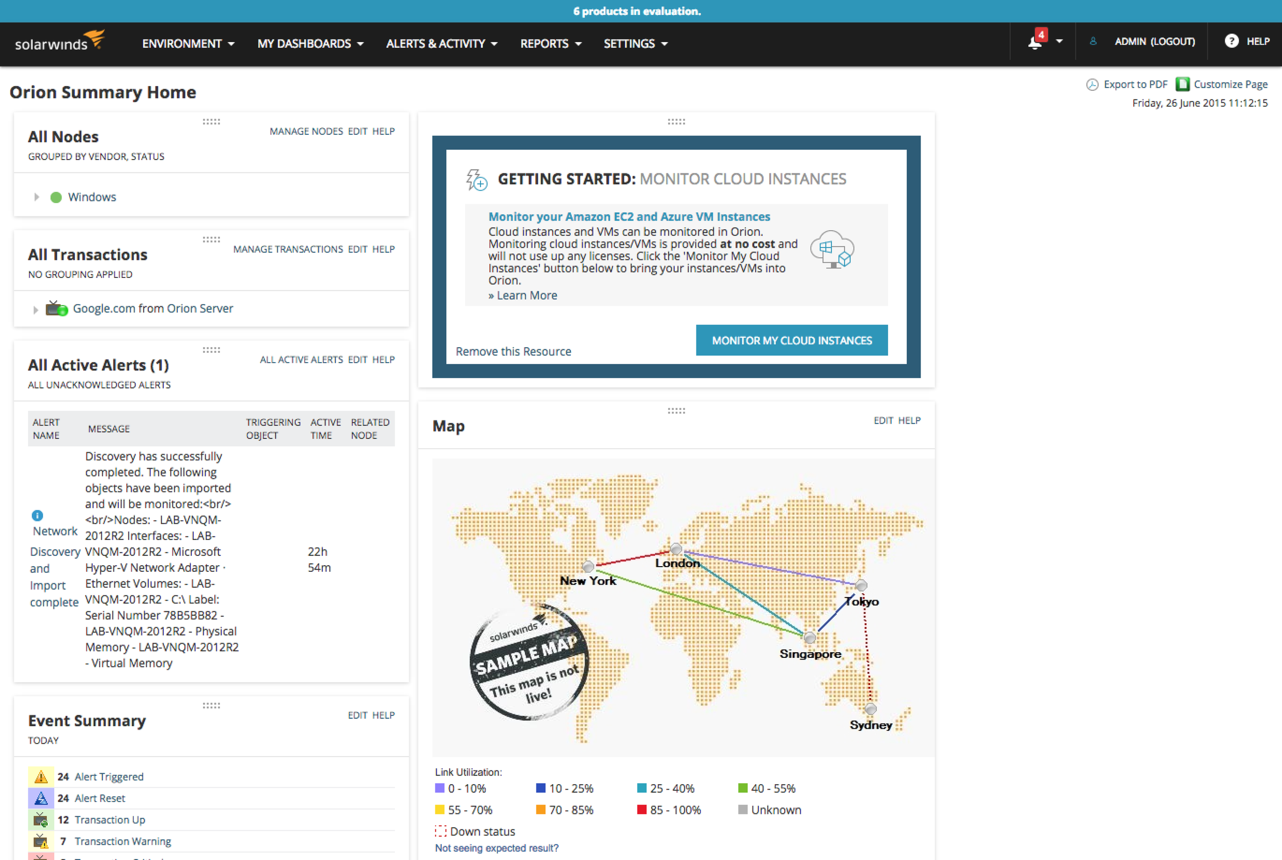
Tabs and functional improvements: reduced visual noise by simplifying color palette, replaced graphic-based buttons with HTML/CSS, added system-wide notifications, created "Getting started" triggers for easy setup, updated graphics like "Sample map"
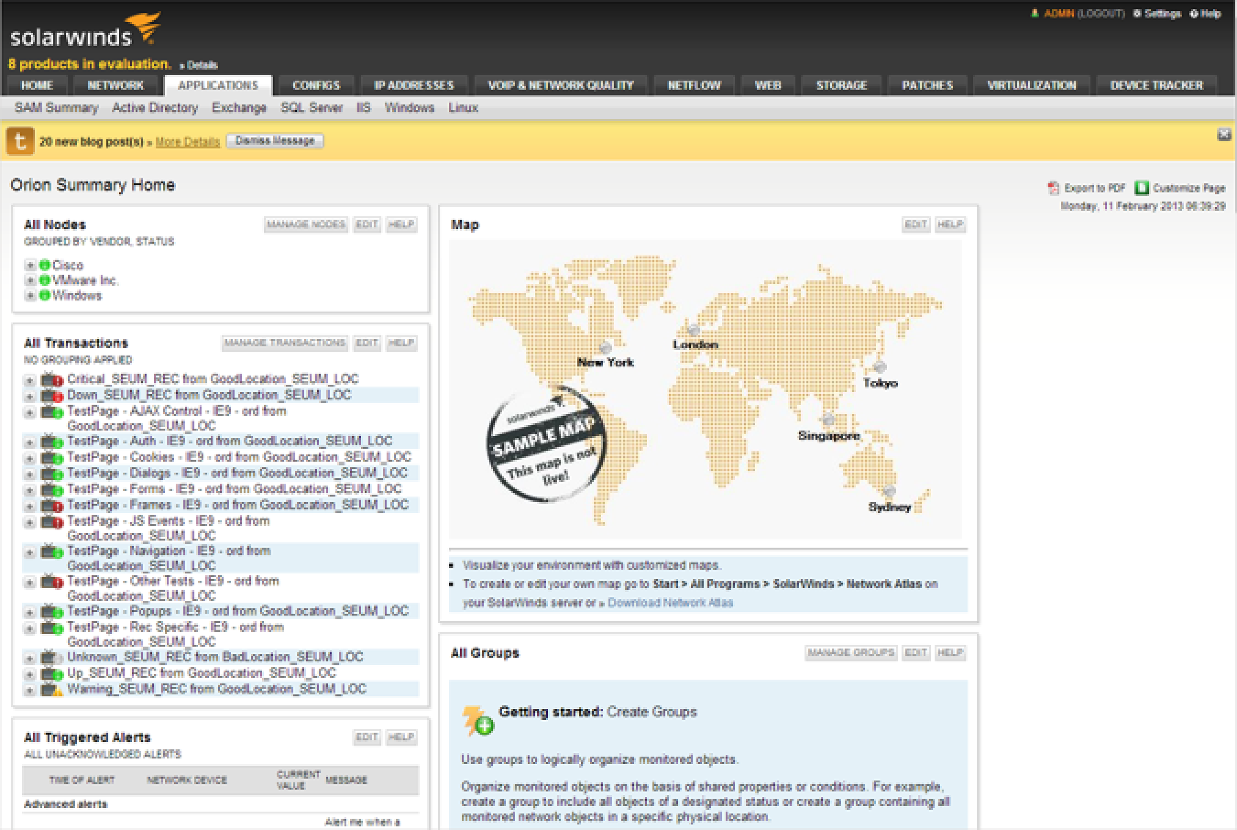
Modernizing details: removed gradients, updated graphics like "Sample map", iterated on button CSS to simplify
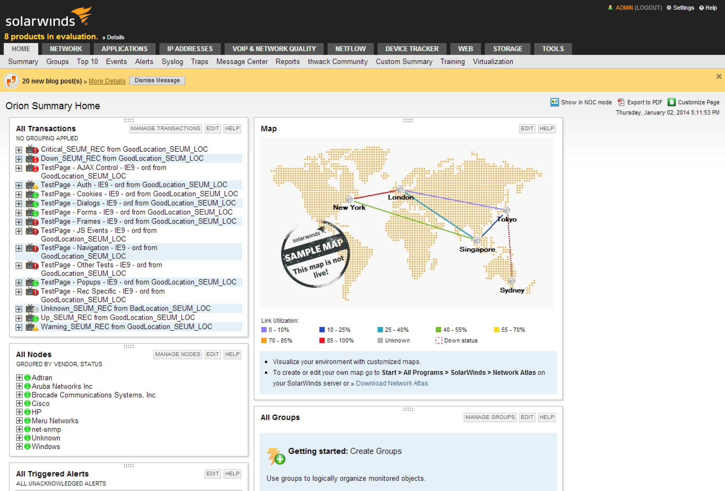
Removed tabs and reduced noise: updated primary navigation to reduce tab-wrapping issues, highlighted the value of platform-wide functionality, reduced visual impact of system-wide notifications, reduced use of colors that do not indicate good/bad status, modernized font (leveraged .com branding), updated icons
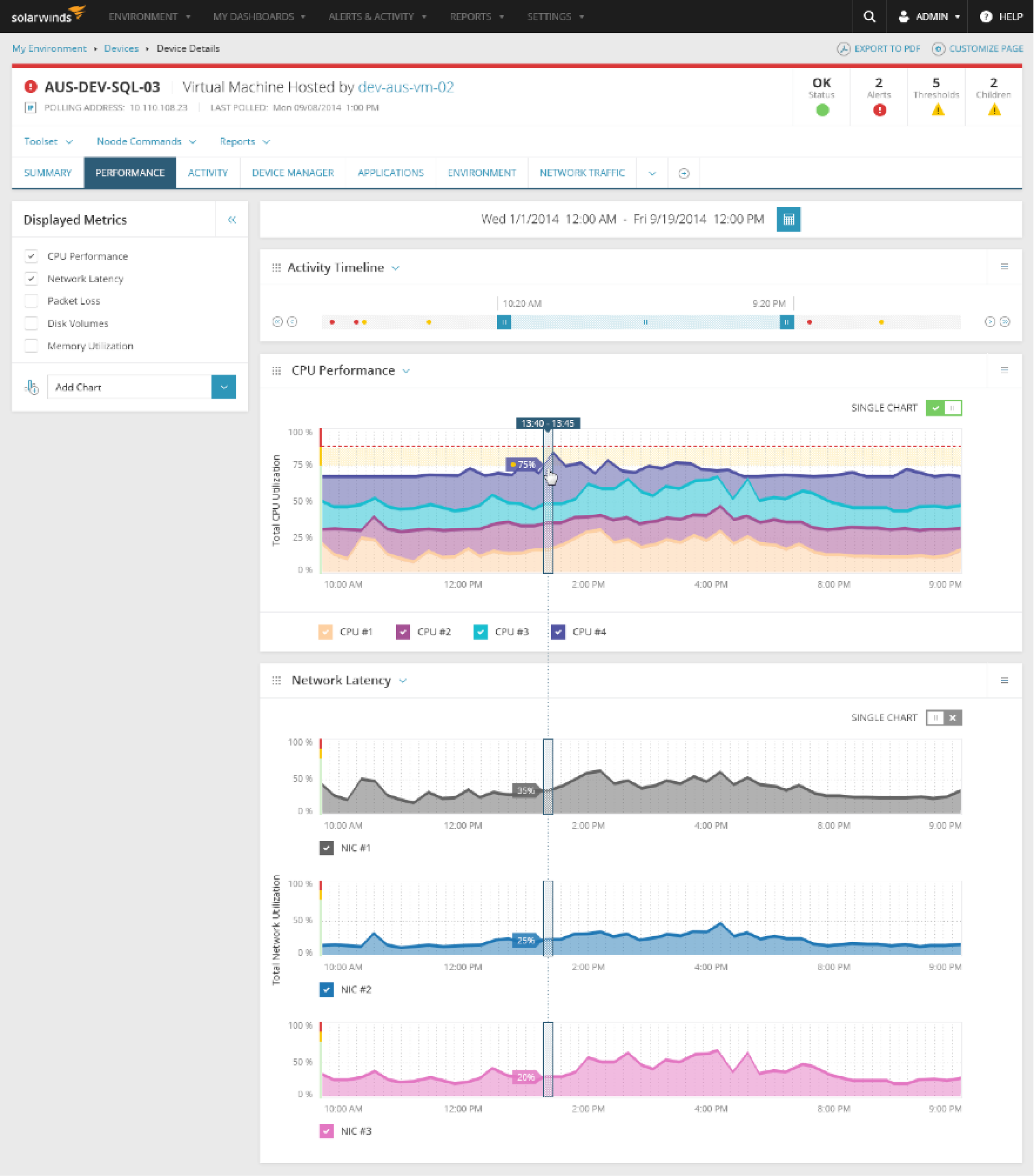
The future: highlight overall status at the top, use color sparingly to draw user's attention, visually correlate data by default, provide methods for wading through large data sets